Role
UI/UX Designer · Web Designer · Framer Developer
Industry
Events · Culture · Entertainment
Duration
January 2026 to March 2026
Deliverables
Website Strategy · UI Design · Responsive Website · Interaction Design · Framer Development
the brief
the brief
the brief
Olam Festival had grown from a local flea market into one of Kerala’s largest cultural festivals, bringing together music, workshops, creators and performances across three days. The challenge was to organise a large volume of information without losing the energy and personality that made Olam unique. The website needed to inform, excite and help visitors confidently book tickets before the festival began.

the challenge
the challenge
the challenge
Festival websites often become information-heavy as schedules, workshops and ticketing grow. The challenge was to translate Olam’s “Happiness Economy” into a joyful digital experience without compromising clarity or making it harder for visitors to find what they came for.

design objectives
design objectives
design objectives
Prioritise Action
Make tickets and workshops immediately accessible from anywhere on the website.
Preserve Identity
Translate Olam’s colourful visual language into a cohesive digital experience.
Organise Complexity
Structure festival information into a clear, easy-to-explore hierarchy.
Create Delight
Use thoughtful motion and interaction to make browsing feel playful without distracting from key tasks.
Prioritise Action
Make tickets and workshops immediately accessible from anywhere on the website.
Preserve Identity
Translate Olam’s colourful visual language into a cohesive digital experience.
Organise Complexity
Structure festival information into a clear, easy-to-explore hierarchy.
Create Delight
Use thoughtful motion and interaction to make browsing feel playful without distracting from key tasks.

designing with context
Instead of formal user research, design decisions were informed by observations from previous editions of the festival, existing user behaviour and how people typically discover cultural events online. Returning visitors already understood the brand; the website needed to help both new and returning audiences quickly understand the experience and take action.

structuring the experience
Visitors usually arrive from Instagram or promotional content looking for practical information rather than browsing aimlessly. The website was organised around their primary goals, understanding the festival, exploring workshops and buying tickets with each section intentionally leading to the next.


the visual language
the visual language
the visual language
Olam’s visual identity was already established. My responsibility was translating that system into an interactive digital experience while designing supporting assets like ticket graphics, layouts and interface elements that felt consistent with the brand.


designing supporting assets
Alongside the interface, I designed supporting graphics used throughout the website, including ticket visuals, promotional assets and interface elements. Working within Olam’s established identity meant extending the brand consistently rather than redefining it.
design decisions
design decisions
design decisions
Motion with Purpose
Motion with Purpose
The Olam ripple, the festival's visual signature in motion. Designed to set the tone immediately. Energetic, colourful, unmistakably Olam.
Interactive Tickets System
Ticket purchasing remained the primary goal throughout the website. Ticket cards were designed to resemble vintage festival tickets while supporting multiple release phases. Active passes remained clickable, unavailable passes clearly communicated their state and colour coding improved scannability.
Motion with Purpose
Motion with Purpose
Motion was used to reinforce the festival’s playful identity rather than decorate the interface. Ripple animations, colour reveals and subtle hover interactions created moments of delight while maintaining usability.
Turning information into Exploration
Workshops contained large amounts of content, so filters, categories and progressive layouts helped visitors browse sessions without feeling overwhelmed.
Turning information into Exploration
Workshops contained large amounts of content, so filters, categories and progressive layouts helped visitors browse sessions without feeling overwhelmed.
responsive design
responsive design
responsive design
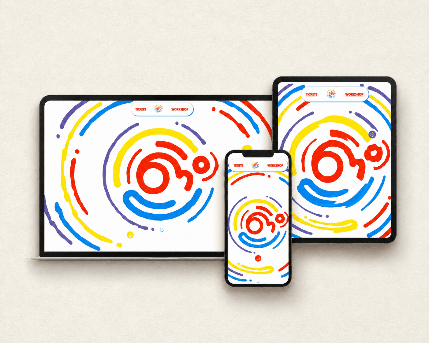
The layout adapts without losing the calm rhythm of the experience. Navigation, spacing and content hierarchy were carefully adjusted for smaller screens while maintaining visual consistency across devices.

validation
validation
validation
Task-based usability testing was conducted across desktop and mobile devices to evaluate navigation, ticket discovery and overall clarity.

0utcome
0utcome
0utcome
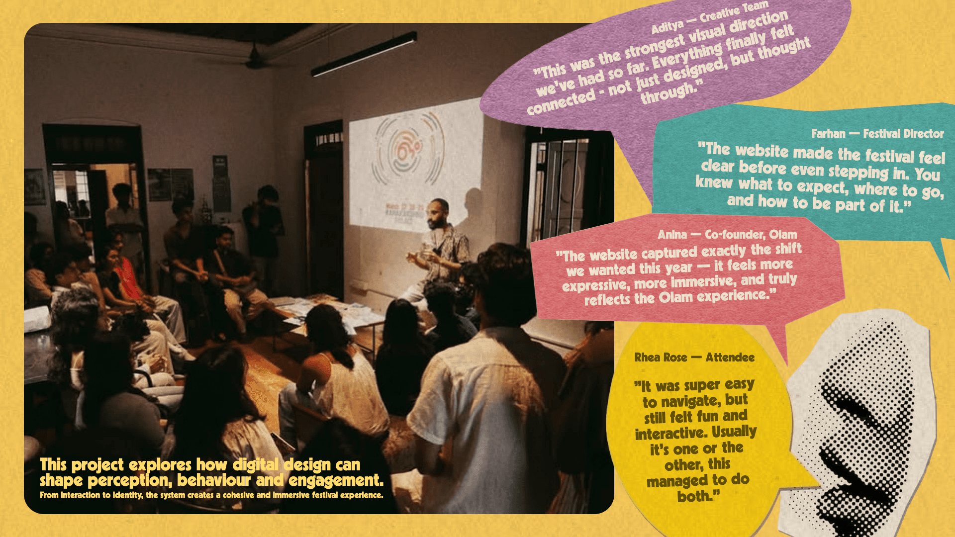
The final website successfully balanced expression with usability, creating a digital experience that introduced the festival, supported exploration and simplified ticket purchasing while remaining faithful to Olam’s identity.

reflection
reflection
reflection
Designing Olam reinforced how digital experiences shape people’s expectations long before an event begins. Working within an established brand system taught me how to translate an existing visual identity into an engaging product while balancing creativity with clear information architecture and responsive implementation.
Explore the Complete Design Process
Dive deeper into the project through the complete visual case study.
curated works.


curated works.


Thanks for stopping by
Open to freelance projects, full-time opportunities, and thoughtful collaborations.
Whether you have a project, an idea, or just want to say hi, my inbox is always open.
find me:
Behance
behance.net/nehasnaushad
linkedin.com/in/nehasnaushad/
instagram.com/nehasnaushad/
© 2026 Neha S Naushad. All rights reserved.

Thanks for stopping by
Open to freelance projects, full-time opportunities, and thoughtful collaborations.
Whether you have a project, an idea, or just want to say hi, my inbox is always open.
find me:
Behance
behance.net/nehasnaushad
linkedin.com/in/nehasnaushad/
instagram.com/nehasnaushad/
© 2026 Neha S Naushad. All rights reserved.

Thanks for stopping by
Open to freelance projects, full-time opportunities, and thoughtful collaborations.
Whether you have a project, an idea, or just want to say hi, my inbox is always open.
find me:
Behance